Покачивание
Наведите курсор!
p.wiggle {
padding:30px;
width:150px;
text-align:center;
background:red;
}
@-ms-keyframes wiggle{0%{-ms-transform:rotate(3deg);}50%{-ms-transform:rotate(-3deg);}100%{-ms-transform:rotate(3deg);}}
@-moz-keyframes wiggle{0%{-moz-transform:rotate(3deg);}50%{-moz-transform:rotate(-3deg);}100%{-moz-transform:rotate(3deg);}}
@-webkit-keyframes wiggle{0%{-webkit-transform:rotate(3deg);}50%{-webkit-transform:rotate(-3deg);}100%{-webkit-transform:rotate(3deg);}}
@keyframes wiggle{0%{transform:rotate(3deg);}50%{transform:rotate(-3deg);}100%{transform:rotate(3deg);}}
p.wiggle:hover{-ms-animation:wiggle .3s 2;-moz-animation:wiggle .3s 2;-webkit-animation:wiggle .3s 2;animation:wiggle .3s 2;}
Обозначение выпадающего пункта меню с помощью смены + и –
Добавим + и - для обозначения выпадающего элемента меню. При наведении на такой пункт меню плюс будет меняться на минус. Добавим + (content: '+';) и - (content: '-'; - на событие hover) с помощью псевдоэлемента :after
CSS:
#navigation {
    height: 2em;
    background: #333;
}
#navigation > li {
    float: left;
    height: 100%;
    margin-right: 0.5em;
    position: relative;
}
#navigation > li > a {
    float: left;
    height: 100%;
    line-height: 2;
    color: #ddd;
    text-decoration: none;
    padding: 0 1em;
}
#navigation > li > a:hover {
    background: #000;
    color: #fff;
}
#navigation ul.sub-navigation {
    width: 12em;
    background: #000;
    position: absolute;
    top: 2em;
    left: 0;
    display: none;
    z-index: 1000;
}
#navigation ul.sub-navigation li {
    display: block;
    margin-bottom: 0.4em;
}
#navigation ul.sub-navigation li:last-child {
    margin-bottom: 0;
}
#navigation ul.sub-navigation li a {
    display: block;
    padding: 0.4em 0.5em;
    color: #fff;
    text-decoration: none;
}
#navigation ul.sub-navigation li a:hover {
    background: #333;
    color: #ddd;
}
#navigation > li.sub:hover ul.sub-navigation {
    display: block;
}
#navigation > li.sub > a:after {
    content: '+';
    display: inline-block;
    width: 20px;
    height: 20px;
    line-height: 20px;
    text-align: center;
    background: #000;
    color: #fff;
    border-radius: 50%;
    margin-left: 5px;
}
#navigation > li.sub:hover > a:after {
    content: '-';
    display: inline-block;
    width: 20px;
    height: 20px;
    line-height: 20px;
    text-align: center;
    background: #000;
    color: #fff;
    border-radius: 50%;
    margin-left: 5px;
}
HTML:
<ul id="navigation">
  <li class="sub"><a href="#">Nav 1</a>
          <ul class="sub-navigation">
                <li><a href="#">SubNav 1</a></li>
                <li><a href="#">SubNav 2</a></li>
                <li><a href="#">SubNav 3</a></li>
          </ul>
  </li>
  <li><a href="#">Nav 2</a></li>
  <li><a href="#">Nav 3</a></li>
  <li><a href="#">Nav 4</a></li>
</ul>
P.S. Вместо минуса лучше поставить – (alt+0150), поскольку минус уже, чем плюс.
А вот так мы не будем менять плюс на минус, но при наведении плюс плавно повернётся на 45° по часовой стрелке:
#navigation li.sub > a:after {
	content: '+';
	display: inline-block;
	width: 20px;
	height: 20px;
	line-height: 20px;
	text-align: center;
	color: #636363;
	margin-left: 3px;
	-webkit-transition-duration: 0.8s;
	-moz-transition-duration: 0.8s;
	-o-transition-duration: 0.8s;
	transition-duration: 0.8s;
	-webkit-transition-property: -webkit-transform;
	-moz-transition-property: -moz-transform;
	-o-transition-property: -o-transform;
	transition-property: transform;
}
#navigation li.sub:hover > a:after {
	content: '+';
	display: inline-block;
	width: 20px;
	height: 20px;
	line-height: 20px;
	text-align: center;
	color: #fff;
	margin-left: 3px;
	-webkit-transform: rotate(45deg);
	-moz-transform: rotate(45deg);
	-o-transform: rotate(45deg);
}
Очистка float с помощью content: "."
.block:after {
	content: ".";
	display: block;
	height: 0;
	clear: both;
	visibility: hidden;
}
Второй способ:
.block:after {
	content: ".";
	display: table;
        clear: both;
}
transform: perspective
CSS:
.container-box {
	width: 100px;
	height: 100px;
	border: 1px solid #CCC;
	margin:30px 10px
}
.box-perspective {
	width: 100%;
	height: 100%;
	background-color: red;
	-webkit-transform: perspective( 300px ) rotateY( 70deg );
	transform: perspective( 300px ) rotateY( 70deg );
	transition: all 1s ease-in-out;
	-webkit-transition: all 1s ease-in-out;
	transform-origin: right;
	-webkit-transform-origin: right;
}
.box-perspective:hover {
	-webkit-transform: perspective( 300px ) rotateY( 0deg );
	transform: perspective( 300px ) rotateY( 0deg );
}
HTML:
<section class="container-box">
  <div class="box-perspective"> </div>
</section>
крышка
Анимация подчёркивания
CSS:
body {
  height: 100%;
  width: 100%;
  padding: 100px 0;
  margin: 0;
  display: flex;
  justify-content: center;
  font-weight: 100;
}

span {
  font-size: 50px;
  color: #333;
  color: transparent;
  text-shadow: 0 0 #333, .08em 0 0 #fff, 0 0, -.08em 0 0 #fff;
  background: -webkit-linear-gradient(#999, #999) center 1.09em no-repeat;
  background: linear-gradient(#999, #999) center 1.09em no-repeat;
  background-size: 85% 1px;
 -webkit-transition: .2s ease;
  transition: .2s ease;
}

span:hover {
   background-size: 100% 1px;
}
HTML:
<span>Подчеркивание ссылок</span>
Анимация на спрайтах
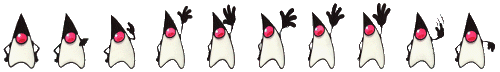
text
CSS:
.hi {
    width: 50px;
    height: 72px;
    background-image: url("http://l920682i.bget.ru/wp-content/uploads/2015/10/sprite.png");
    -webkit-animation: play .8s steps(10) infinite;
       -moz-animation: play .8s steps(10) infinite;
        -ms-animation: play .8s steps(10) infinite;
         -o-animation: play .8s steps(10) infinite;
            animation: play .8s steps(10) infinite;
}

@-webkit-keyframes play {
   from { background-position:    0px; }
     to { background-position: -500px; }
}

@-moz-keyframes play {
   from { background-position:    0px; }
     to { background-position: -500px; }
}

@-ms-keyframes play {
   from { background-position:    0px; }
     to { background-position: -500px; }
}

@-o-keyframes play {
   from { background-position:    0px; }
     to { background-position: -500px; }
}

@keyframes play {
   from { background-position:    0px; }
     to { background-position: -500px; }
}
HTML:
<div class="hi"></div>
Выравнивание блока по центру
С помощью CSS (ширина и высота неизвестны):
.parent {
  position: relative;
}
.child {
  position: absolute;
  top: 50%;
  left: 50%;
  transform: translate(-50%, -50%);
}
Или:
CSS:
* {
    margin: 0;
    padding: 0;
}
body, html {
    height: 100%;
}
.container {
    display: flex;
    align-items: center;
    justify-content: center;
    height: 100%;
}
.container p {
    width: 400px;
    padding: 15px;
    background-color: #f1f1f1;
}
HTML:
<div class="container">
  <div>
    <p>Lorem Ipsum - это текст-"рыба", часто используемый в печати и вэб-дизайне. Lorem Ipsum является стандартной "рыбой" для текстов на латинице с начала XVI века.</p>
  </div>
</div>
С помощью jQuery (ширина и высота неизвестны):
jQuery.fn.center = function () {
    this.css("position","absolute");
    this.css("top", ( $(window).height() - this.height() ) / 2+$(window).scrollTop() + "px");
    this.css("left", ( $(window).width() - this.width() ) / 2+$(window).scrollLeft() + "px");
    return this;
}

//Use the above function as:
$(element).center();
Порядок псевдоклассов для ссылок
a:link {    /* unvisited link */
    color: #FF0000;
    text-decoration: none;
}
a:visited {    /* visited link */
    color: #00FF00;
}
a:hover {    /* mouse over link */
    color: #FF00FF;
    text-decoration: underline;
}
a:active {    /* active link */
    color: #0000FF;
}
a {
}
a:link {
}
a:visited {
}
a:focus {
}
a:hover {
}
a:active {
}Маркер - изображение
ul {
    list-style-type: none;
}
ul li {
    background-image: url("arrow.png");
    background-position: 0px 5px;    /* X-pos Y-pos (from top-left) */
    background-repeat: no-repeat;
    padding-left: 20px;
}
Управление положением заголовка таблицы
caption {
    caption-side: bottom;
}
Удаление пунктирной линии вокруг активных ссылок
a, a:acive, a:focus {
    outline: none; /* Works in Firefox, Chrome, IE8 and above */
}